Home / Blogs / Optimize Your eCommerce Website For Mobile: The Key To Business Success
Optimize Your eCommerce Website For Mobile: The Key To Business Success
 SEO
SEO
Introduction
As the digital world revolves, mobile devices have emerged as the preferred device for online shopping. For your e-commerce business to thrive, you must embrace mobile optimisation. Let's look into the essential concepts and approaches that will help you leverage the huge potential of mobile commerce and propel your business to new heights.
So, why is mobile optimization essential? Let's dive into the key reasons:
- Streamline navigation and user experience
A packed or complicated mobile site may soon turn away potential clients. Implement an organised and straightforward user interface to simplify navigation. Make menus, buttons, and links large enough to tap easily, even on small displays. Streamlining the user experience makes it easier for visitors to locate what they're searching for.
- Optimise product pages for mobile
Your product pages are the heart of your e-commerce website. Make certain that they are mobile-friendly. Provide brief, well-structured product descriptions and use high-quality, mobile-responsive photos. Allow customers to easily zoom in on product photos and view product descriptions without pinching or zooming.
- Simplify the checkout process
The checkout procedure is an important step in the consumer journey. Potential purchasers can be put off by lengthy or complicated payment forms. Implement a streamlined, mobile-friendly checkout experience that includes address and payment information autofill options. Reduce the number of processes involved in making a transaction.
- Optimise for local and mobile search
Local and mobile search optimisation is essential for gaining clients in your area. Make certain that your website is listed on Google My Business and other relevant local directories. Maximise the use of location-based keywords and produce content that speaks to local search intent. This allows you to capitalise on the rising trend of "near me" searches.
- Test and measure perform
Regularly check your website on different mobile devices to identify any issues. Take note of load times, broken links, and usability issues. Track mobile user behaviour, conversion rates, and other crucial data using tools like Google Analytics. This information can help you in fine-tuning your mobile optimisation approach over time.
- Speed by website's load time
Mobile users frequently look for immediate access to information and products. Slow-loading websites may frustrate visitors and increase bounce rates. Improve the efficiency of your website by compressing pictures, reducing HTTP requests, and utilising browser caching. A quicker website not only improves user experience but also improves search engine rankings.
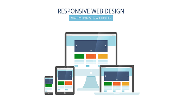
- Showcase optimised videos and images
Engaging mobile users requires visual content. Ensure that videos and photos are optimised to be viewed on mobile devices. To modify media items based on screen size and orientation, use responsive web design. This guarantees that your content appears beautiful on mobile devices and loads swiftly.
- Avoid pop-ups and ads
Creating a user-friendly surfing experience necessitates careful management of pop-ups and advertisements. Explore using unobtrusive, non-disruptive overlays or modals that do not obstruct user navigation. Use ad management tools to ensure that advertising is relevant and not too intrusive. Monitor and optimise your ad placements on a regular basis to find the proper balance between monetization and user satisfaction.
- Avoid using heavy content
It is important to avoid using too complicated words while generating content. Readers might become overwhelmed with such content, making it more challenging for them to connect with it. Aim for clarity, simplicity, and conciseness instead. Optimise your blog content into digestible chunks and use clear language to convey your message effectively.
Conclusion
Optimising your e-commerce website for mobile devices is no longer a choice; it is a need to be competitive in today's ever-changing digital world. Mobile users are a substantial and increasing portion of online customers, and meeting their demands is key to the success of any business.
At Verve Media, we understand the necessity of optimising e-commerce websites for mobile consumers. We can help you construct a mobile-friendly website that increases conversions and engages your audience with our knowledge of mobile website creation and optimisation. To understand better, explore our services and how we can optimise your e-commerce website. Our team of experts is ready to help you create a mobile-optimised e-commerce website that will maximise your online success. Contact our digital marketing company in Mumbai and let's get started!